Every Olympics, the medal design becomes a topic of conversation. But the 2026 Milano Cortina Winter Games medals have sparked something more, a full-blown debate. "Why is there a line down the middle?" "Is that a chocolate coin?" "It's gorgeous!" Here's the story behind the single line dividing the world's opinions.
The Story Behind the "One Line"
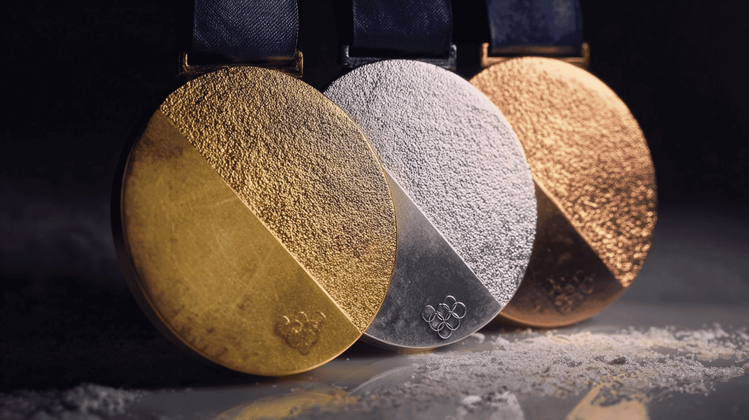
The official medals for the 2026 Milano Cortina Winter Olympics were unveiled on July 15, 2025, at the historic Palazzo Balbi in Venice, Italy. Designed by a team led by Raffaella Paniè, the Brand, Identity and Look of the Games Director, and crafted by Italy's state mint (Istituto Poligrafico e Zecca dello Stato, or IPZS), the medals immediately caught the world's attention, though not everyone agreed on whether that attention was favorable.
The standout feature is a single diagonal line that divides the medal into two halves. One half has a granular, matte texture, while the other is mirror-polished. The Olympic rings sit at the junction of these two surfaces, and the reverse side features the event name and the Milano Cortina 2026 emblem.
The two-halves concept carries layered symbolism. It represents the union of Milan and Cortina d'Ampezzo, the first Olympics officially co-hosted by two cities. It symbolizes the bond between athletes and their support systems: coaches, teammates, families, and fans. And it draws from the Italian avant-garde art movement, expressing the idea of unity through constant motion and transformation.
"We conceived a medal that represents purity and a return to essence," explained Paniè. "We celebrate the strength found in difference: two unique halves that join through the Olympic and Paralympic symbols to deliver a bold and unified message."
Specs and Sustainability: Recycled Metal, Renewable Energy
Each gold medal weighs approximately 500 grams (about 1.1 pounds). Per Olympic Charter requirements, the base is sterling silver with at least 6 grams of pure gold plating. If made of solid gold at today's market price (roughly $110 per gram), each gold medal would be worth around $55,000.
What sets these medals apart is their environmental commitment. The metal comes from recycled manufacturing waste, all production energy is sourced from renewables, and the protective finish is eco-friendly, non-toxic, and fully recyclable.
In total, 1,146 medals were produced: 735 for the Olympics (245 each of gold, silver, and bronze) and 411 for the Paralympics (137 each).
A World Divided: "Beautiful" vs. "Boring"
The debate ignited when Jackie Redmond, a caster on TNT Sports' "NHL on TNT," posted images of the medals on X (formerly Twitter) with the caption "Beautiful, right!?"
Reactions flooded in, split almost evenly:
Admirers praised the medal's Italian elegance, "The silver one is gorgeous," "Really cool design!," and "Less is more, very Italian." Critics questioned the central line, "Why is it split in half?", "Kind of plain, but... maybe that's okay?", and the now-viral "Is there chocolate inside?"
Multiple comments specifically targeted the diagonal line, asking "Why is there a line in the middle?" The minimalist approach proved divisive because the design's meaning isn't immediately self-explanatory. Unlike Paris 2024's medals with visible Eiffel Tower iron pieces or Tokyo 2020's medals made from recycled electronics, Milano's concept requires context to fully appreciate.
Notably, some commenters invoked the 2010 Vancouver medals as the gold standard for Winter Olympics medal design, suggesting that Milano's ultra-simple approach faces stiff competition in the court of public opinion.
How Japan Is Reacting
In Japan, opinions are just as varied. Overall, the Milano Cortina Games' visual identity has been received warmly, the food-themed sport pictograms featuring pasta, cheese, and coffee have been hugely popular on Japanese social media. "This is so Italian, so Milan, absolutely gorgeous!" is a common refrain.
However, when it comes specifically to the medal design, some Japanese fans feel the concept doesn't quite land at first glance. Japan's design-conscious audience tends to favor medals with immediately recognizable storytelling, Tokyo 2020's recycled electronics medals and Paris 2024's Eiffel Tower-embedded medals both resonated strongly with Japanese fans because the story was visible in the object itself.
"I appreciate the philosophy behind it, but you need to read the explanation to understand," one Japanese commentator noted. Others took a wait-and-see approach: "I bet it looks completely different in person," and "What matters is how the athletes react when they receive them."
What overshadows the design debate in Japan is excitement about the team's medal prospects. Japan won a record-breaking 18 medals at the 2022 Beijing Games and is targeting even more this time. Regardless of what the medals look like, the hunger is to bring home as many as possible.
Medal Design Through History: Where Milano Fits
Looking at recent Winter Olympics medals reveals an evolving design philosophy. PyeongChang 2018 featured striking three-dimensional edges inspired by Korean alphabet characters. Beijing 2022 drew from ancient Chinese jade bi discs with concentric ring patterns. Paris 2024 (Summer) broke new ground by physically embedding iron from the original Eiffel Tower.
In this context, Milano Cortina's medals represent a deliberate departure, Italian minimalism taken to its purest form. Rather than adding layers of ornament, the design team stripped everything back to essential lines and contrasting textures. It's the "Less is more" philosophy that the fashion capital of the world might naturally gravitate toward.
Whether you love it or not, the design has succeeded at one undeniable thing: getting the world talking. And perhaps that's the most Italian move of all, provocation through elegance.
What's the most memorable Olympic medal design you can recall from any Games? Does Milano's minimalist approach resonate with you, or do you prefer medals with more visible storytelling? We'd love to hear how this looks through the lens of your culture!
References
- https://news.yahoo.co.jp/articles/9a62cf652f29f63e49967cfca6728c61546c982b
- https://www.olympics.com/en/milano-cortina-2026/brand/medals
- https://www.olympics.com/en/milano-cortina-2026/news/milano-cortina-2026-reveals-medals-olympic-paralympic-winter-games/
- https://www.fashionsnap.com/article/milano-cortina-olympics-2026/
- https://artsfuse.org/323906/design-review-the-look-of-the-2026-milano-cortina-winter-olympic-games/
- https://nationaljeweler.com/articles/14108-2026-winter-olympic-medal-design-symbolizes-unity
- https://www.nbcnewyork.com/olympics/2026-milan-cortina/history-winter-olympic-medals-milan-cortina/6446830/


Global Discussion
16 comments